Undertone @ 1 WTC

Quote with mustache layout for the Dalí room.

Quote with mustache layout for the Dalí room.

What do Georgia O’Keeffe, Banksy and Dalí have in common? Other than being artists, nothing. They’re all from different time periods and have vastly different styles of creating art. However, the folks at Undertone loved that about these artists and wanted to bring their flavor together in this new soup called “our new office”.

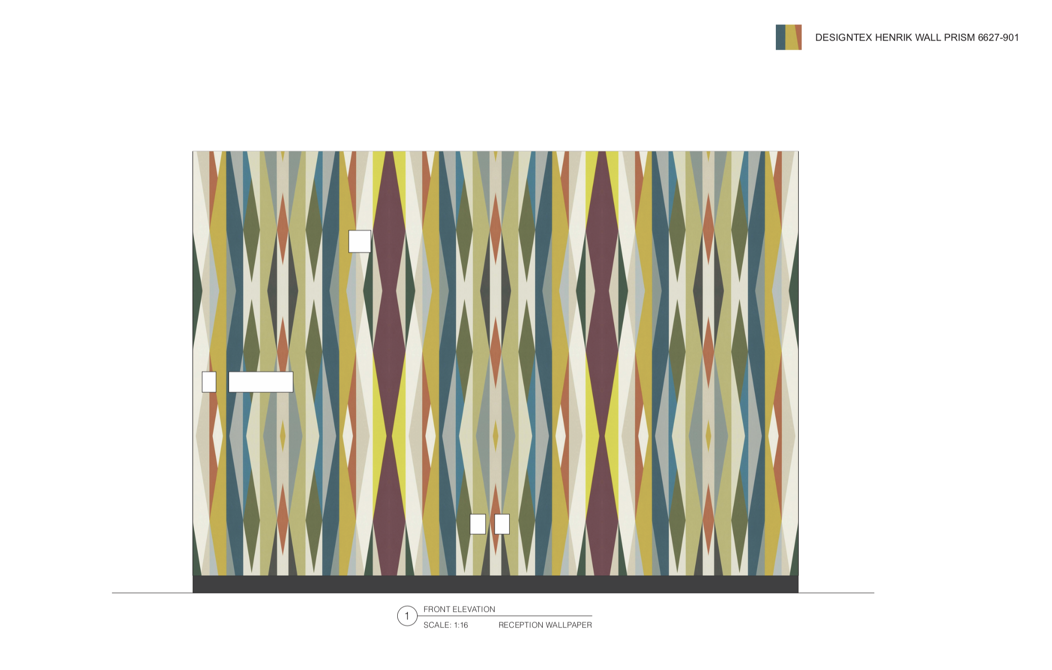
The information I got was simple: a floor plan with room labels, quotes that were to be used and the artists’ names, and ideas of what imagery was desired. Basic, but helpful. The rest was up to my team and me…my team being just the team lead and me in the beginning, then the other two guys later on during install. Over our holiday break, my team lead and I sent files back and forth—I did the research and laid everything out, he was the second set of eyes that looked over everything. Between the two of us, all of the window vinyl (less than 100 panels) was in production in two days with client approval.

Quote layout designed by me; a stencil was applied to the wall to ensure straight lines and proper alignment

Quote layout designed by me; a stencil was applied to the wall to ensure straight lines and proper alignment

As the month went by, more research, back and forth (at a minimum) and product sourcing went by. Where does one find a real bull’s skull? eBay, of course! And how about the gradient wallpaper behind it? Make the gradient, we’ll print it in our shop!

If there’s one thing I learned from this job, it’s that Annie Leibovitz does not mass print any of her photographs. How bougie.

Where do the picture frames come from that go around the images you can get? The shop! Nope, shop won’t make them in the short amount of time you have, so then what? Buy them! From an online frame store! Luckily a coworker had just bought from said e-store for another job and was happy with the outcome.

unnamed.jpg

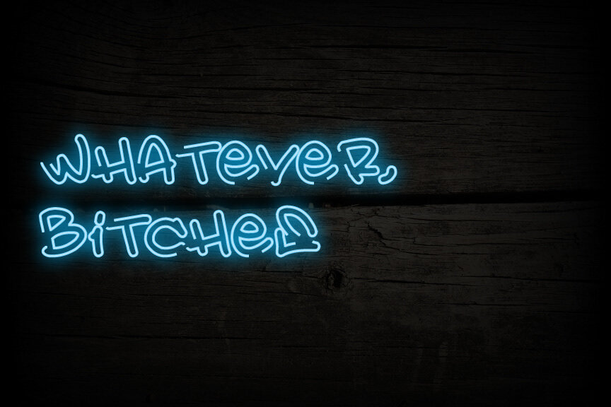
How about that pantry wall? Design the type for the quote and make a stencil!

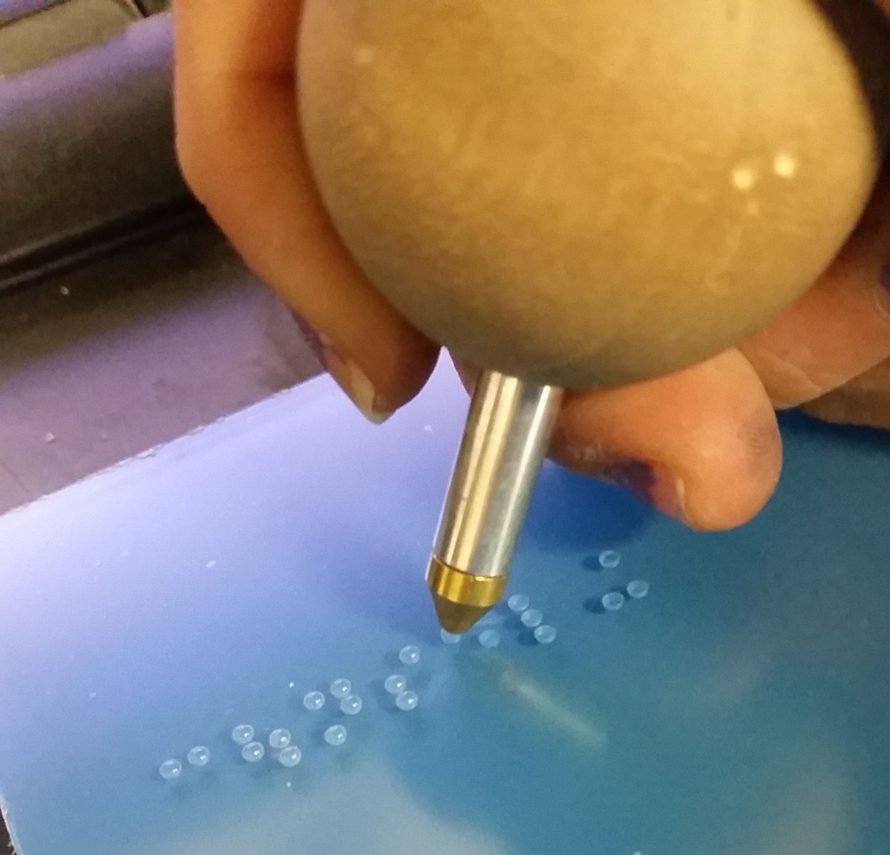
What about the wall decals? eBay! No! MAKE THEM IN THE SHOP—production costs are lower than sourcing and purchasing each one. And that mirrored bear as homage to Jeff Koons? Make it; just needs a little DS VHB on the back, maybe some silicone.

This is probably one of the more fun jobs I got put on and the view from Undertone’s office on the 77th floor is amazing. Wouldn’t mind doing something like this again.

Notice Me, Senpai

7hudRIYST2GRKhhB50iexw.jpg

What lengths will people go through to get a job? For me, I try a variety of things: I tell jokes in my cover letters, with a bold claim that I am full of dad jokes for any occasion; I submit pictures of me partaking in activities that relate to the company (see exhibit A to the left—me drinking a local brew down in Raleigh, NC at a wedding while sitting on a rock; it was an attempt to get someone from Quaker City Mercantile to at least respond to my submissions); and I try to kiss ass.

At any given time 8-10 years ago, I would have gotten a response. Most likely “no”, but a response nonetheless. And most of these responses were personal—in the sense that someone took the time to write out “no” in so many words and sent it off. Now I’m lucky if I get just an automated response.

Why is it so hard to get a job these days? Or even just a response. Places like URBN (parent company to Urban Outfitters, Nuuly, BHLDN, Anthropologie, Terrain and URBN Food and Beverage) has their careers webpage set up as a serve yourself spot where you search the jobs, apply, and then come back to see where you’re at in their queue. In the 8 or so jobs I’ve applied to with them, just this morning I earned another notch on my reject belt but there are two jobs on there (one I applied to in April and one in October) that seem to be stuck with the “In progress” message following it. I attended an information session last week on Temple’s main campus for URBN and the internships and FT roles they’re hiring for. I then attended an “interview” in the same place the next day. It wasn’t what I thought it would be, but it gained me a connection to the inside world of URBN.

I want to work in advertising or branding and identity. Bonus points if I land in an agency that rolls all of that into one. I’m getting a bit desperate, though. So much so, that even though I swore off working in EGD ever again, I applied to an architect’s office in the city where their job description fit like a glove with my actual experience. A laughable moment was when I announced I applied to Interior Architects to my boyfriend who, without skipping a beat, opened his eyes wide and said, “What if you get hired?”

“Well, babe, if I get hired, that means I have a job.” Duh.

The convo then went into the whole thing about me escaping EGD-land and doing my own thing, working where I know I’ll be happy. But when getting a business off the ground has taken a hiatus, you’ve been out of work for a few months and your savings is dwindling (bills don’t pause, y’all) and you’re a 30-something creative who needs medical benefits and would happily take a 401k with some steady pay, you begin to lower your standards a bit and look in places you don’t really want to be in.

So this begs the question, how does Senpai notice me? I began tailoring my resume to read the way I need it for specific jobs, create new sample PDF portfolios as additional collateral for each application, and write cover letters that sometimes make me want to barf due to the high level of ass-kissing I do just to get a response.

The cockblockers in this game are third party software/websites larger (and smaller) places use to help offset the number of applicants they get for any given position that’s posted. If your resume or cover letter don’t contain the words they’re looking for, actual human eyes will never lay on your submission. You’ll never be noticed.

I contemplated doing it the old school way for a while: dropping into studios with leave-behinds (portfolio sample, resume, business card) or using actual physical mail methods to send in my stuff… The problem is, a lot of studios and agencies are really weird with unexpected guests and because a lot of them use that third party software or app that takes the place of having to pay someone to do it using actual manhours, I feel like it would be a surefire way for my stuff to be thrown into the wastebin.

So as it stands, I’m still trudging along, trying to talk to people when I can to make connections, attending AIGA events when I’m available (and it’s free) and stalking career pages and job boards. One day, Senpai will . notice me and I’ll be the happiest 30-something creative with a 401k and steady pay.

Inclusiv NYC

Color page for the 3-D logo on the main wall.

Color page for the 3-D logo on the main wall.

Client: Inclusiv NYC

Project: 39 Broadway Interior EGD

Designer: drive21/Inclusiv/DBI

Fabricator: XD FOUR

Color elevation for the Designtex Henrik wallpaper for the reception accent wall.

Color elevation for the Designtex Henrik wallpaper for the reception accent wall.

Sometimes companies want to brighten up or update their spaces. It could be a new 3-D logo, some LED lights, maybe new wallpaper or—an extreme—a whole new floor in an office building. Luckily, the people at Inclusiv just wanted some wallcoverings and a 3-D logo. Simple, right? Right.

So what goes into something like this? It starts with the client. Either they know what they want or they don’t. In this case, the ladies at the company knew what they wanted but not how they wanted it. My job was the figure this out. I took what I knew and did the drawings. My teammate went and got a survey for the estimator and me—the estimator would use that info to price out wallpaper, vinyl, time and manpower cost and I would use it to do all the important creative stuff.

Screen Shot 2019-10-15 at 2.21.22 PM.png

For this job, it was simple: lay out things that needed to be laid out (like the vinyl square bands for the glass distraction banding), design things that need to be designed (like the wallcovering in their Skype Room), and show where everything was going and how high (like the 3-D logos).

Screen Shot 2019-10-15 at 2.21.35 PM.png

What they asked for: 2” x 2” white vinyl square distraction banding, each square 2” apart, on each set of glass in the office spaces; One accent wall with the Henrik wallpaper from Designtex, one 3-D logo for the main wall in the reception area, one repeated logo pattern wallcovering that was darker than the painted wall color in the Skype room and two sets of reverse-cut vinyl logos for the front doors.

Unfortunately, I left the company before the installation took place, so I have no final install photos, but I’m sure everything went up without a hitch.

Design Quickies: Thoughts That Are NSFW

Sometimes, when those co-workers won’t leave you the heck alone, you just gotta be like. “whatever, bitches.”

Sometimes, when those co-workers won’t leave you the heck alone, you just gotta be like. “whatever, bitches.”

Have you ever just had a rotten day at work and literally curse to yourself in a string like Jason Schwartzman’s character, Albert Markovski, does in the very beginning of I <3 Huckabees? Maybe you’ve mentally given the finger to Karen after she, for the third time this week, told you all about her shih tzu’s vacation at the Tropical Dog Paradise Resort, then accused you of wasting her time when she realized you weren’t listening because you had a report due in seventeen minutes?

You’re not alone.

This isn’t to say I was like this every day at work. Just some days when people wouldn’t leave me alone, despite having the “snooze” icon next to my name on Google Hangouts, or when the phone would ring non-stop, having 3-4 calls in a row, 30 minutes a pop. Only when there were fires (and there were a LOT of fires at my last two jobs) that needed to get put out and I was the only one who could. Those times.

That moment when you finally get Microsoft Word to do that thing you need it to do for the 2:00 meeting that’s in…well, it actually started five minutes ago.

That moment when you finally get Microsoft Word to do that thing you need it to do for the 2:00 meeting that’s in…well, it actually started five minutes ago.

As one of my daily design quickies, I decided to take these frustrations (and honestly, they can even be used during moments of triumph—if you’re that type of person) and my newfound skill of using Adobe Illustrator to recreate neon to make a short series of things that cross people’s minds that aren’t safe for work.

Although the concept is simple (layering colors, stroke weights and filters), it gets tedious (layering colors, stroke weights and filters) to “design” neon. I had to learn this in order to properly do drawings for projects that involved neon so the client would have a better idea of what the final product would look like.

The backgrounds I used in these pieces were images I had taken myself. I was inspired by neon on brick walls—the dingier the better. Gave it character. Although my walls aren’t dingy (I only had an hour and a half or so to do these), I tried to make them dark enough to have an ominous feel while light enough so you can have an idea of what the surface is.

So the next time you want to cuss someone out for being themselves, before you type a “fuck-you-esque” message to someone in an email out of anger and accidentally send it—just use your skills to let it out in a creative way.

Sit down, Karen—I don’t care about your dog’s trip to the Tropical Dog Paradise Resort.

Sit down, Karen—I don’t care about your dog’s trip to the Tropical Dog Paradise Resort.

ADA Signage - Learning and Applying Knowledge and Skills

Photo credit: Myself—I used my Samsung Galaxy S3 to photograph my own hand manually inserting braille rasters into holes drilled by machine into a 1/4” thick piece of P95 acrylic.

Photo credit: Myself—I used my Samsung Galaxy S3 to photograph my own hand manually inserting braille rasters into holes drilled by machine into a 1/4” thick piece of P95 acrylic.

When I took the job at Urban Sign in September of 2013, I was very much under the impression that I would be just their in-house graphic designer. What unfolded during the five years I was employed there was much more than pushing around pixels on the screen.

I started to learn more and with each new thing I learned, I was also given new responsibilities and eventually I was able to run production by myself. One of the subjects I had to learn about (and more or less teach myself) was interior ADA: how to design it, how to make it and how to install it.

So what goes into a standard ADA sign for, say, a restroom? More than you think!

It starts with the verbiage. What does the sign need to say? Bathroom? Ladies? Restroom? From there, a layout is designed. Restroom (or any other) signs can be any shape or size, so as long as your isotype (icons) sit in a space that is a minimum of 6” tall (no minimum height for the isotype themselves), your copy is no smaller than ⅝” high but smaller than 2”, the space between your copy and braille, and around the braille is no more or less than ⅜”, the braille rasters protrude from the sign no more or less than 1/32” and are domed, and the colors on the sign are contrasting enough that anyone from any distance can tell them apart. Oh, and the braille on the sign MUST follow the copy and be grade 2.

Did I lose you yet?

The aforementioned specs are not guidelines, but rather lawful standards written in the ADA (American Disabilities Act) manual of design standards. Although it’s rare for someone from ADA to walk into your establishment and whip out a ruler to measure your braille, if you’re found to be in violation of ADA code, you face up to $75,000 for your first offense, with each following offense looking at $150,000 a pop. So before you send out that ADA sign for install, make sure it follows all the proper code.

A sign I laid out and assembled for a space at Drexel University. This sign was fabricated out of bent aluminum, 1/32” thick non-glare acrylic material, clear raster braille and screen printed copy.

A sign I laid out and assembled for a space at Drexel University. This sign was fabricated out of bent aluminum, 1/32” thick non-glare acrylic material, clear raster braille and screen printed copy.

I was HORRIFIED when I moved on to my next job at drive21 and, while poking through previous job folders on their drive, found that more than half of the jobs they worked on had violations all over the ADA signage. Most of them having come from design firms or the clients themselves and no one on staff knowing any better to correct any of it. I made it my own personal mission to make sure that future jobs would not suffer so as long as I could help it. The folks I worked with closely at Cadwell Signs up in Holliston, MA, during my time at drive, dubbed me the ADA Kween because I was able to have conversations about what we were working on, not just listen and agree. I was able to teach one of the designers what I knew about ADA and on every call after that, I was greeted with “The Kween as arrived.”

A sign I made from photopolymer. Photopolymer allows you to process signs with all raised elements (isotype, copy and braille) at the same time. The entire sign is painted its base color, which in this photo is a charcoal gray, and the isotype and c…

A sign I made from photopolymer. Photopolymer allows you to process signs with all raised elements (isotype, copy and braille) at the same time. The entire sign is painted its base color, which in this photo is a charcoal gray, and the isotype and copy are tipped (sometimes hot stamped) the contrasting color, which here is white.

I’m not an expert. In fact, there’s SO much to know, learn, understand and apply that I could still take a 101 course and learn 2x more than what I already know. Each city, state and country, even, has their own proprietary set of laws (code) that govern how ADA is to be manufactured. California is notorious for stricter laws and codes on everything, so I wish drive the best of luck when they finally make their west coast expansion next year.

The craziness of it all is how fine some of the details are and how serious some places are with…well…everything. From the materials (do you want to use Nova or Jet?), to the cost (what do you want to spend?), to what it needs to look like (does it need to be photoluminescent? Are you using acrylic? Will you dome the braille by hand or rely on paint coats?) to methods of production (are you using the Raster® Braille method or will the braille be left behind in washout?), there are always a HUNDRED AND ONE questions to ask when making these signs.

I could go on with this post, but as I noted before, there is SO much information when it comes to ADA, that it’s impossible to keep it all contained in one blog post. But if you want to read some serious stuff on ADA, visit the ADA.gov website.